SharePoint Drop-Down Component
The SharePoint data component allows you to easily display information from a data source in a drop down menu, this can include SharePoint lists, Excel files and much more!
Important configuration
Section titled “Important configuration”The component stores the selected source row as an object. Configure Fields with every property that the form needs to retain; calculations can then read values such as data.site.SiteCode. Do not configure Form.io’s valueProperty, because that would discard the row object Team Forms expects.
Remove Duplicates compares the complete stored objects after Fields has been applied. If the drop-down displays Location but Fields also retains SiteCode, two rows with the same location and different site codes are not duplicates. To show unique locations, set Fields to only Location. Only that field will then be stored, so include additional fields when the form needs them and accept that uniqueness applies to their combined values.
Other advanced settings include:
| Builder setting | Schema property | Behaviour |
|---|---|---|
| SharePoint List | dataSourceId | Exact ID of an existing Team Forms data source. |
| Item Template | template | HTML using item, for example <span>{{ item.Location }}</span>. |
| Label Property | labelProperty | When setting Item Template directly, use { "label": "🛠 Custom", "value": "custom" } so the custom template remains editable in the builder. |
| Fields | selectFields | Property paths retained in each selected object. |
| Sample Item | sampleItem | A representative projected row used for email suggestions, connector schemas, and advanced-code types. The builder normally derives it from preview data. |
| Remove Duplicates | removeDuplicates | Removes identical projected objects. |
| Sort By | sortBy | Property path used to sort the rows. |
| Sort Direction | sortDirection | asc or desc. |
| Filter Query | filterQuery | JavaScript that assigns show using the current item and form data. |
See the data-source component schema reference for complete JSON examples and AI-assistant rules.
Custom Template
Section titled “Custom Template”The SharePoint drop-down component can also be customized to render a custom template for each item. This powerful feature gives you full control over what is displayed using standard HTML syntax. To use a custom component simply:
-
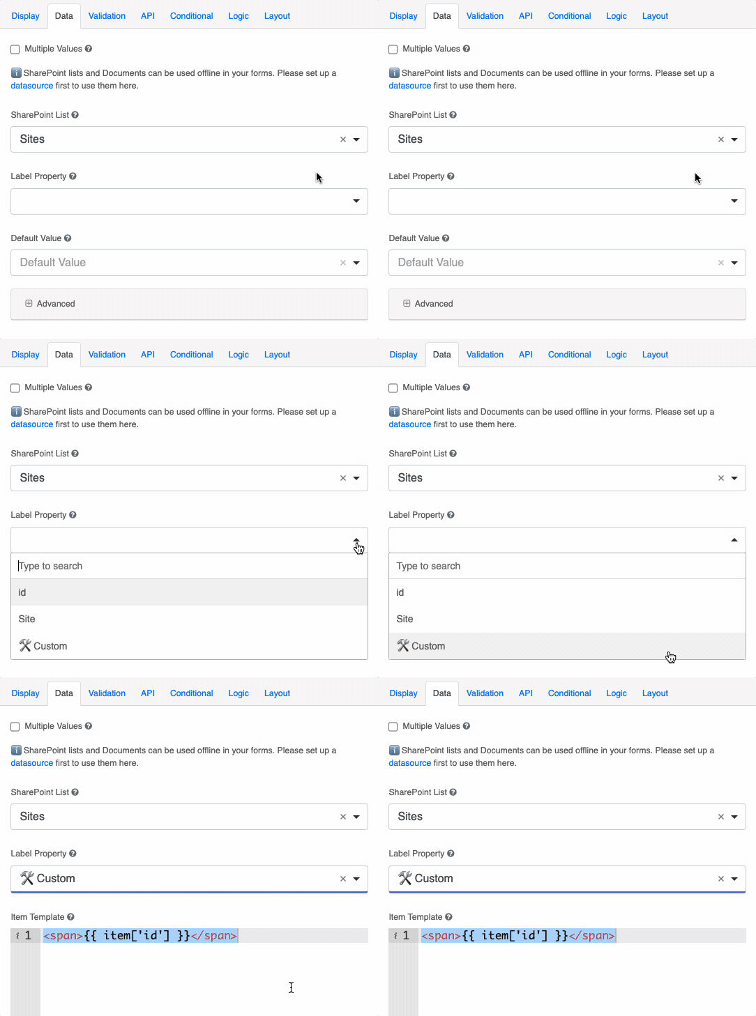
Open the data tab of your SharePoint data component
-
Under the “Label Property” field choose “🛠️ Custom”. This will launch a HTML code widow to provide a custom template.
You can use this to display multiple fields from your drop down menu or style the items how you like. Below we provide two common examples of using the custom template feature.
Display Multiple Fields
Section titled “Display Multiple Fields”Using the custom template feature you can display multiple fields/columns from your data source in a single item of the drop down menu. In the Example below we show how you can display a users first name, last name and position.
Item template:
<div>{{ item.firstName }} {{ item.lastName }}</div><small>{{ item.position }}</small>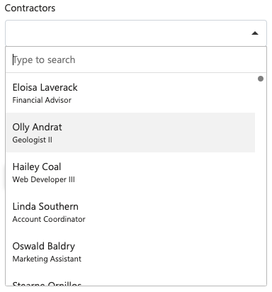
Display Multiple lines
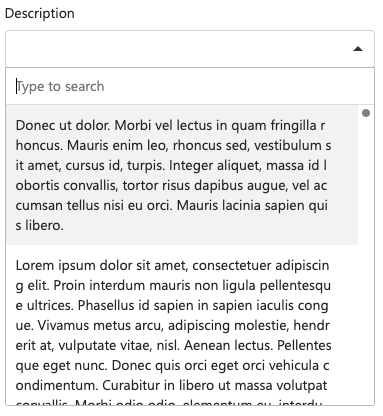
Section titled “Display Multiple lines”By default the SharePoint data component will display a single line of text for consistency of sizing and spacing among other components. However in some circumstances it may be desirable for the text inside the component to wrap over multiple lines to display a larger amount of text. In these situations you can use custom inline CSS in your template to force the text to wrap.
Item template:
<div style="text-wrap:wrap">{{ item.description }}</div>