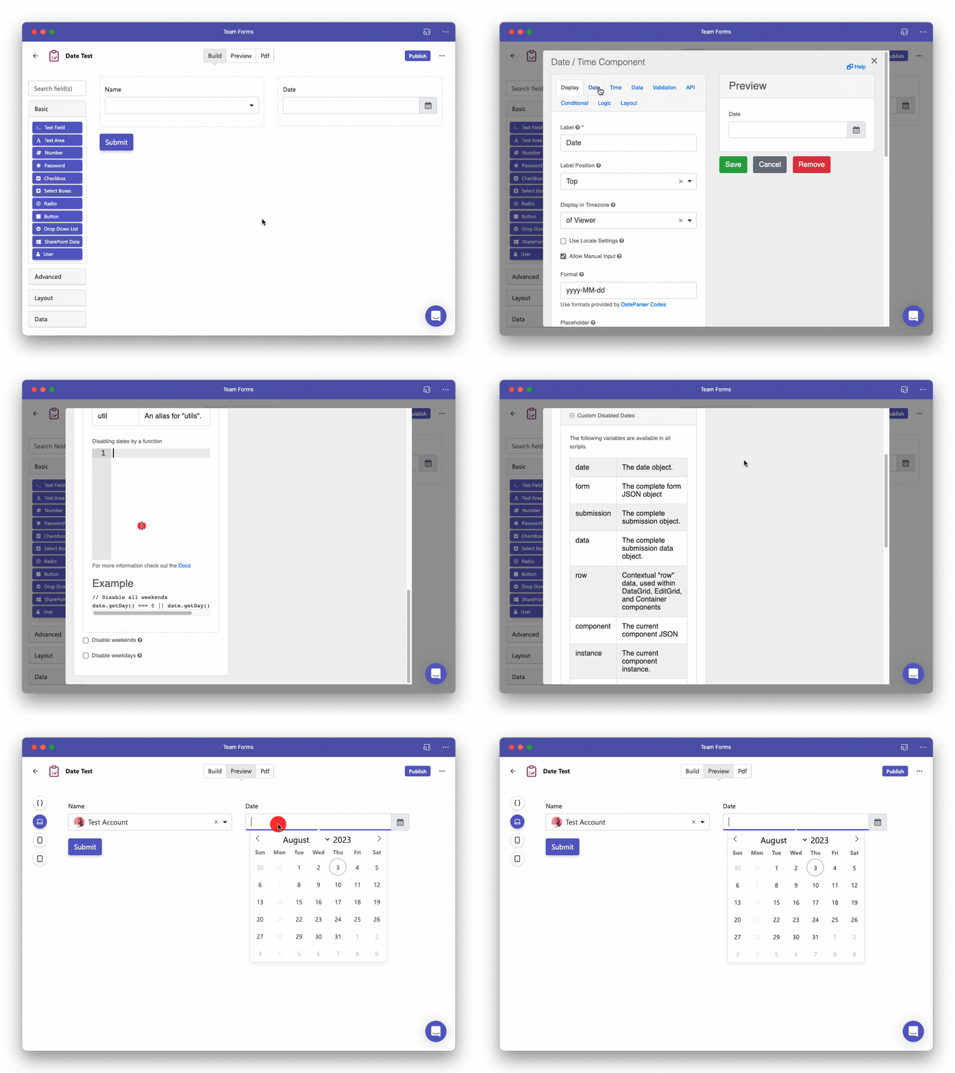
Date/Time Component
The Date/Time component is a power feature that allows you to add a date picker to your forms.
Default to the current Date/time
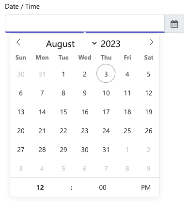
Section titled “Default to the current Date/time”Is often useful to default the Date/Time component to todays date. This can easily be done by following the steps below:
-
Navigate to the data tab in the component settings
-
Tick the “Default to current date” option.
-
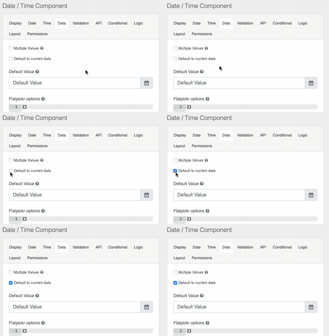
You could also optionally disable the date/time field to prevent users from changing the value. To do so simply open the settings for the date/time component and tick the disabled option under the display tab.
Date Only Picker
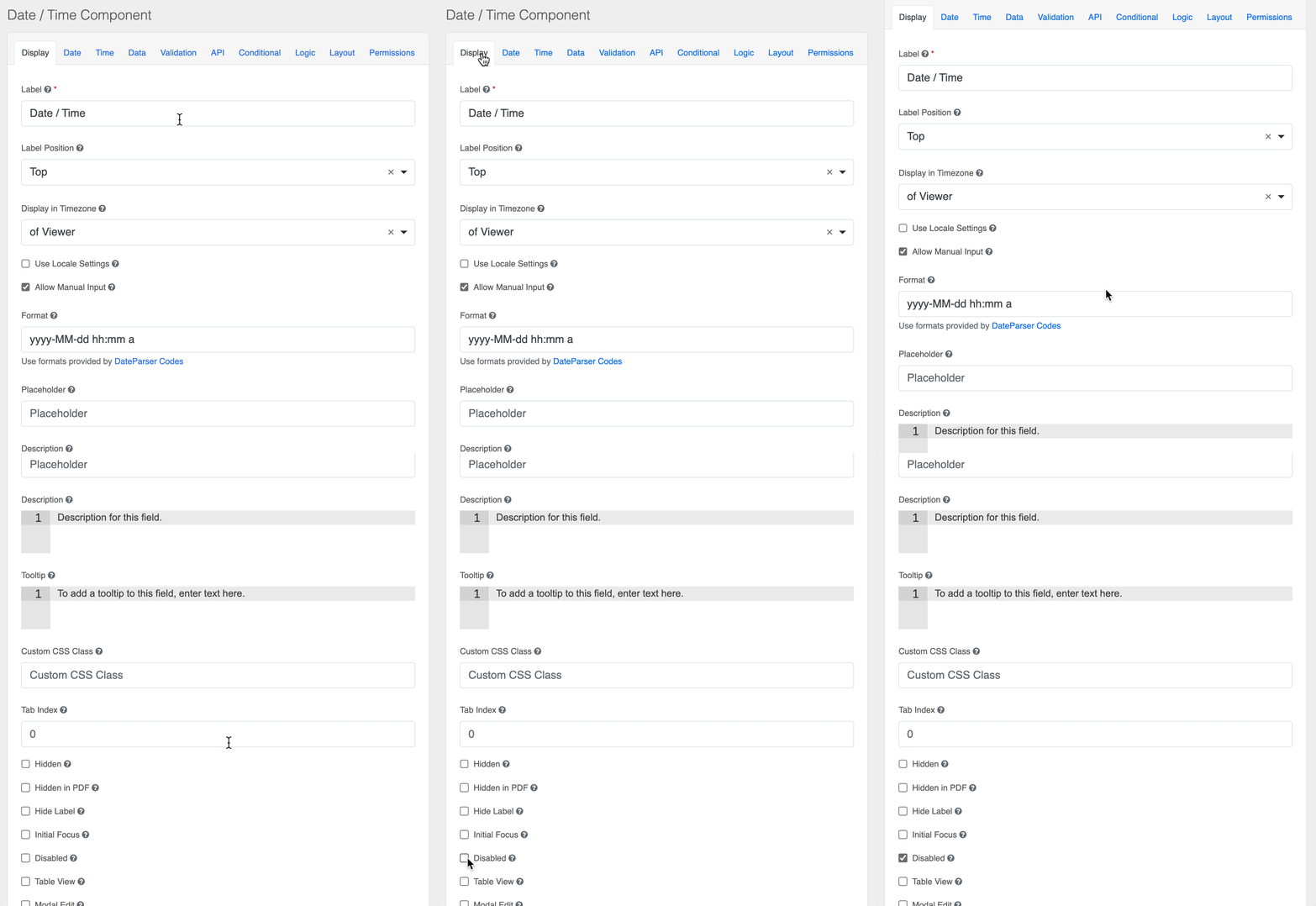
Section titled “Date Only Picker”If you want collect a date without the time, you should consider using the date component instead. The date component is available under the “Advanced” heading just above where you see the date/time component. Alternatively you can also configure the Date/Time component to only accept dates by disabling the time feature in the time tab.
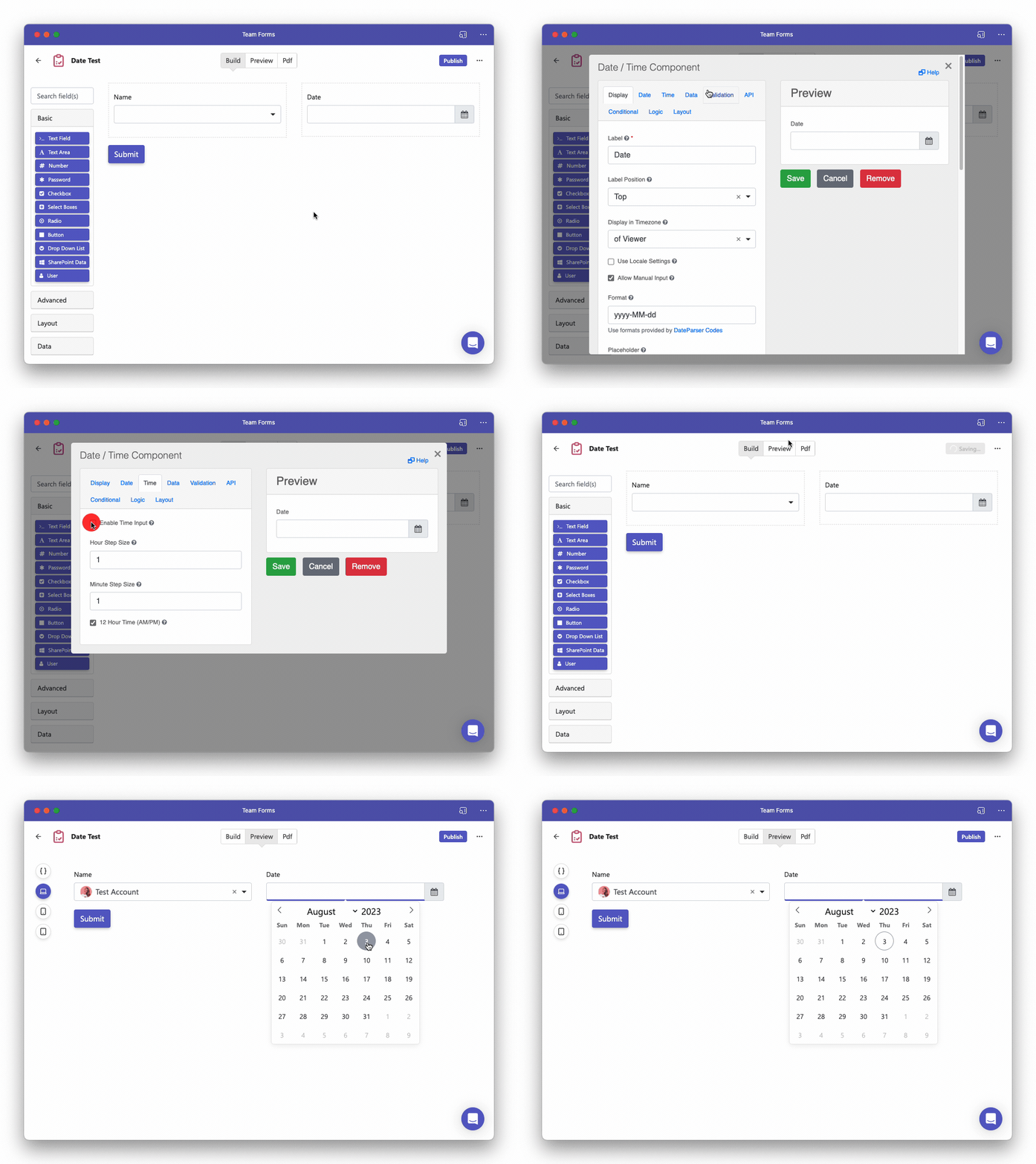
Restrict Dates
Section titled “Restrict Dates”In many situations it can be useful to restrict the dates available to choose from. For example you may want to enable weekdays or dates within the next two weeks. We can easily restrict the dates using some simple JavaScript in the “Custom Disable Date” option. Below we provide a few common examples
Disabling all weekends
disabled = date.getDay() === 0 || date.getDay() === 6Disable all Mondays
disabled = date.getDay() === 1Disable past days
disabled = date <= moment().startOf('day').toDate()Disable dates more than 14 days in the future
disabled = date > moment().add(14, 'days').toDate()